I didn’t have too much trouble when using photoshop due to the fact that I’d had a bit of experience form using it for my AS production and at the beginning of our course we had some training. I had to use it when creating my film poster and magazine cover and the large range in tools meant it was preferable to other image editors.
In order to create the same sinister, foreboding atmosphere present in the teaser trailer I needed it to be very dark, I did this by painting the background black and creating a shadow-like effect with a large black brush with very little ‘hardness’ over my protagonists face. I also lowered the brightness and saturation in order to give it a more gritty, realistic feel.
In order to make it a more conventional poster I used the spot healing brush to get rid of any blemishes or spots on her face as posters and advertisements are known for having no imperfections.
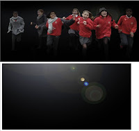
To create a sense of danger and threat I resized my images so that the school children running would appear at risk. In addition, I came across a spotlight effect which I placed behind them to further the sense of threat and panic.
I-movie
 For the creation of my teaser trailer, I-movie was not the ideal program to use. This is because the cutting tool is not as precise as other programs and as a teaser the shots should be incredibly quick. Also I wanted to create a panic-filled atmosphere towards the end and it was incredibly difficult to do so. However, as I used it last year I didn’t have any trouble with how to use it overall.
It also allowed me to upload images, which is used for the first three shots with the institutional information. The ability to add in title slates meant that it was incredibly simple for me to create my slates, title slate, date and tagline.
 When adding in the sound, I had trouble with editing to make it build up in the same way the shots do. To overcome this I split a section of it, copied it and added it to the other layer so both were playing at the same time, creating a busy, more intense sound, which was more in conjunction with the shots.
 Blogger
For recording the progress of my coursework, I used blog site- ‘Blogger’. This is a perfect use of Web 2.0 and is relatively easy to use, allowing me to quickly post updates of my research, planning and final products. However, when using a lot of text and images in a post it makes it difficult to layout correctly which can be quite time-consuming.
Facebook
I used Facebook when getting audience feedback as it was an effective way to reach my target audience of teenagers and guarantee more replies than a paper copy which I used for the audience research.
Freeplay music/Free sound
When finding music I was incredibly inspired by the theme from ‘28 days later’ as it build up tension in the way that I wanted. However, due to the copyright restriction I couldn’t use it. The use of freeplay music gave me a place to search for similar un-copyrighted music, it took me a while to find one that I could use, and resulted in music which was not completely what I was looking for but made the whole process of finding non-diegetic sound a lot simpler.
Freesound allowed me to find the gunshot sound which I needed at the end which otherwise would have be difficult to get.
Cameras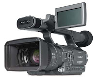
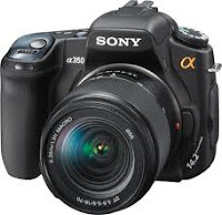 When taking my images I had to use a DSLR, I had never used one before but they are extremely easy to use so I didn’t have a problem. I had a bit of trouble when taking the images of the students running as I found it wasn’t quick enough and didn’t know how to change the shutter speed so I made them run from further away to overcome it so I had more time to take the photo.
Cameras

 When taking my images I had to use a DSLR, I had never used one before but they are extremely easy to use so I didn’t have a problem. I had a bit of trouble when taking the images of the students running as I found it wasn’t quick enough and didn’t know how to change the shutter speed so I made them run from further away to overcome it so I had more time to take the photo.
 For film shooting I used a Sony HDV, which I used last year so I was used to it meaning that I could use a large range of camera angles and shot types. The display screen allowed me to look back at shots and re-film if needed and the use of auto-focus meant that whilst filming I didn’t have to worry about what was in focus as it was done automatically. However, my lack of knowledge and ability regarding the sound and microphone meant that avoided using dialogue in order to keep the overall sound of the teaser good quality.


